
When a child learns a new skill or reduces a challenging behavior during Applied Behavior Analysis (ABA) therapy, caregivers and therapists celebrate the victory. But how do the professionals actually know the intervention is working and not just a temporary phase?
The answer lies in the data. In ABA, collecting data during a session is only half the battle; the real impact comes when you turn that raw data into a visual graph. Graphing is the universal language of behavior analysis.
It allows clinical teams to take hundreds of individual observation points and turn them into a clear, visual story that parents, teachers, and insurance companies can immediately understand.
What Is ABA Data Graphing?
ABA data graphing is the systematic process of taking raw behavioral measurements, such as how many times a child raised their hand or how long a tantrum lasted, and plotting them visually on a chart.
Instead of forcing a supervisor to stare at a clipboard full of tally marks or scroll through a spreadsheet filled with numbers, practitioners use graphs to see exactly how a behavior is changing over a specific period of time.
It is a visual representation of a client's daily learning journey. By putting raw data points onto a standardized graph, Board Certified Behavior Analysts (BCBAs) can immediately spot behavioral patterns and shifts that would otherwise stay hidden in a pile of written notes.
Why Is Graphing Important in ABA?
Graphing is not just a tedious paperwork requirement; it is the core tool behind every clinical decision in a treatment plan. Because ABA is an evidence-based science, practitioners cannot rely on their gut feelings to determine if a child is making progress.
Data-Based Decisions
Human memory is naturally flawed. A therapist might feel like a child had a "great week" because Friday went perfectly. However, the graph provides objective evidence of whether the behavior actually improved across the entire week.
Judging Intervention Effectiveness
By analyzing a graph, a BCBA can tell if a specific teaching strategy is working. If the graph shows no progress after two weeks, the clinician knows they need to change the treatment plan immediately rather than wasting months on an ineffective strategy.
Clear Communication
Graphs make complex clinical data easy to digest for parents, school staff, and insurance payers. Showing a parent a clear downward trend in self-injurious behavior gives them concrete evidence that their child is making real progress.
Common Types of ABA Graphs
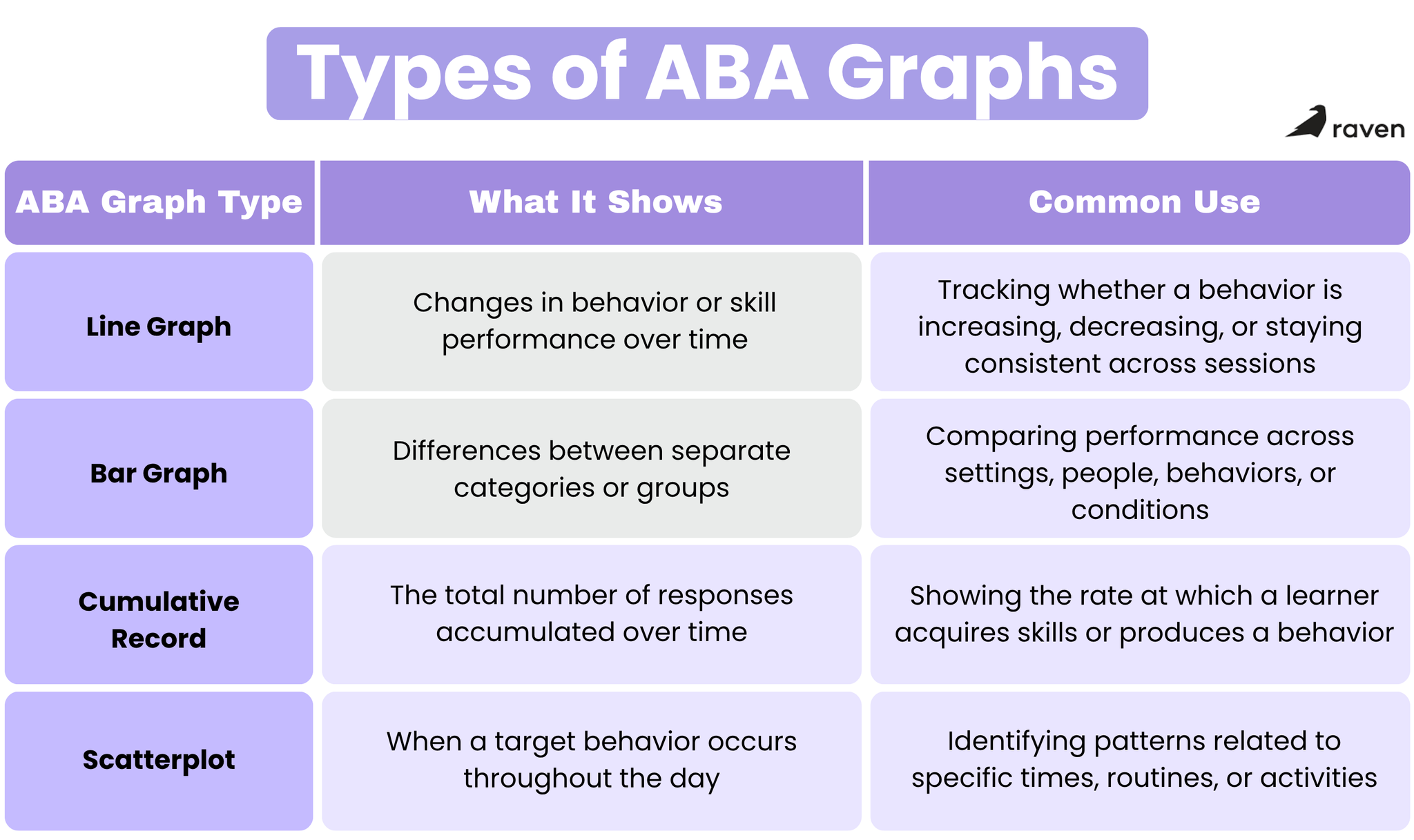
Several distinct types of graphs are used in the ABA field. A clinician chooses the specific graph format based on what kind of behavior they need to measure and what visual story they need to tell.
Line Graphs
This is the most frequently used graph in all of ABA. It tracks behavior over time, making it easy to see if a daily living skill is increasing or a problem behavior is decreasing from one therapy session to the next.
Bar Graphs
These are utilized to compare different categories or distinct groups of data quickly. For example, a bar graph might compare how many times a child successfully uses a communication device at home versus how many times they use it at school.
Cumulative Records
In a cumulative record, the data line only ever goes up or stays flat; it is impossible for the line to go down. Each new data point is added to the previous total. This graph is excellent for showing how rapidly a child is acquiring a new skill set, such as learning fifty new vocabulary words over a month.
Scatterplots
These unique graphs plot occurrences of a target behavior against the specific time of day. They are used to figure out if a behavior happens more often during specific routines, revealing hidden triggers like a child consistently engaging in challenging behavior right before lunch or during transition times.
Key Components of an ABA Graph
To read and understand an ABA graph correctly, you must be familiar with its basic building blocks. Almost every standard line graph used in behavioral therapy shares the same core elements.
The X-Axis and Y-Axis
The x-axis is the horizontal line at the bottom, which typically represents time, such as observation dates or session numbers. The y-axis is the vertical line on the left, which represents the measurement of the behavior, such as frequency, duration, or percentage.
Data Points and Data Paths
A single data point represents the actual measurement taken during one specific session. A data path is the solid line drawn to connect these individual points, showing the overall flow and progression of the behavior.
Phase Change Lines
These are vertical lines drawn straight down through the graph to visually separate different conditions. They indicate exactly when a major change occurred in the environment, like moving from the initial baseline (before treatment) to the active intervention, or starting a new medication.
Phase Labels
Positioned at the very top of the graph, these short titles tell the reader exactly what was happening during that specific section of the data, using clear terms like "Baseline," "Extinction," or "Token Economy."
How to Read an ABA Data Graph
Interpreting a graph goes beyond just noticing if a line is moving up or down. Visual analysis in ABA starts with three features within each phase: level, trend, and variability. When comparing phases, analysts also look at immediacy of effect (how quickly the behavior changes after a phase change) and the degree of overlap between data points in adjacent phases.
Level
This refers to where the data points naturally sit on the y-axis. You look to see if the points are generally high up on the graph or hovering near the bottom. A consistently high level in a problem behavior means it is occurring at a high rate.
Trend
Trend describes the overall direction the data path is moving across time. An ascending trend means the behavior is steadily increasing, a descending trend means it is successfully decreasing, and a zero or flat trend means the behavior isn’t moving in either direction.
Variability
This feature looks at how much the data points bounce up and down from one session to the next. If the points are clustered tightly together, the data is highly stable and predictable. If the points zigzag wildly from the top of the graph to the bottom, there is high variability. High variability usually indicates that the behavior is unpredictable and the current intervention does not yet have strong control over the behavior.
Common ABA Data Graphing Mistakes
Even experienced professionals can make graphing errors that distort how a treatment plan is viewed by the clinical team or the insurance payer. Avoiding these mistakes is crucial for client success.
1. Connecting Data Paths Across Phase Lines
A data path should never cross a vertical phase change line. If you draw a line connecting baseline data directly to intervention data, it becomes impossible to see the immediate effect the new intervention had on the behavior.
2. Ignoring the Baseline
Failing to collect or graph enough baseline data before starting a treatment is a massive clinical error. If you do not know exactly what the behavior looked like before therapy began, you have nothing to compare your intervention against, meaning you have no way to show that the intervention produced the change.
3. Overinterpreting a Single Data Point
One terrible day or one unexpectedly perfect day does not establish a clinical trend. Reacting emotionally to a single spike on the graph rather than looking at the broader, long-term pattern often leads to rushed, unnecessary changes to a treatment plan that was otherwise working fine.
Using Digital Tools for ABA Data Graphing
In the past, therapists graphed everything by hand using pencils, rulers, and grid paper. This was time-consuming and prone to basic mathematical errors. Today, modern ABA practices rely on advanced digital data collection software to automate the graphing process.
Programs designed specifically for the behavioral health industry allow Registered Behavior Technicians (RBTs) to simply tap a button on a tablet to record a behavior, and the software automatically updates the visual graph in real time.
This instant digitization means a BCBA can log in from a remote office, look at the freshly updated trend line, and make immediate clinical adjustments without having to wait for the technician to submit physical paperwork at the end of the week.
Digital tools also format phase lines correctly, prevent calculation mistakes, and keep the data safely stored and compliant for rigorous insurance audits.
Conclusion
Graphing is the heartbeat of Applied Behavior Analysis. It takes the chaotic, overwhelming reality of everyday behavior and organizes it into a clear, actionable format.
By utilizing specific graph types like line graphs and cumulative records, and accurately interpreting the level, trend, and variability of the data points, practitioners can remove the guesswork from therapy.
Avoiding common visual mistakes and adopting modern digital software ensures that the data is always accurate and reliable. Ultimately, a well-maintained ABA graph does more than show an intervention is working; it serves as a powerful visual celebration of a learner's hard-earned progress and a roadmap for their future success.
Sources:
https://www.passagehealth.com/blog/aba-graphs
https://www.artemisaba.com/blog/aba-graphs-visual-analysis
https://bcbamockexam.com/graphing-visual-analysis-aba-level-trend-variability/